I have been playing around with Windows 8 a lot lately. As I browse the forums at Microsoft, I have realized that they are not going to bring the start menu back. No matter how much people complain, they simply refuse.
I heard there is a registry hack that can bring the start menu back. I have not tried it, but I heard it still works.
Microsoft promises this will be removed in the final release.
So what to do? Windows 8 does seem better in many ways. It boots faster, many of the supporting applications like task manager have been given a complete overhaul and are great.
I still feel like my hands are tied behind my back with the start menu gone. No matter how long I use the new metro start screen, it still is not as efficient as the 17 year old start menu.
I found the perfect answer. It is called classic shell. It is a free utility that brings back the start menu goodness.
You start out by downloading the latest version from here:
http://classicshell.sourceforge.net/
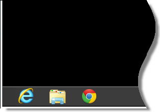
After that see the small but important change.
Windows 8 Before:
Windows 8 After:
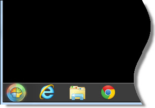
Yea, I admit that button looks like the logo for a well known gas company, but thing is so customizable you can even change that if you want.
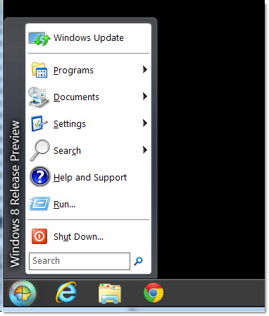
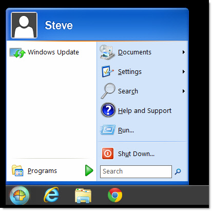
There are a bunch of skins you can choose from.
You can get that Windows 7 look:
The Windows XP style:
Or old school:
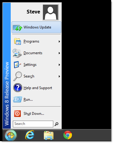
The best part is now that you have the start menu, important things are not hard to find (Or many clicks away). All your settings can be easily reached just like in the old versions of Windows:
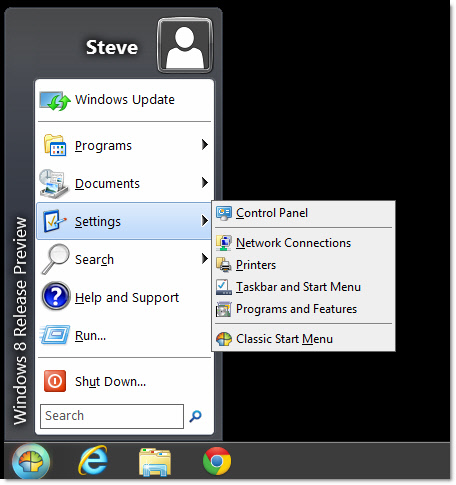
I almost forgot – the most revolutionary idea of all. A way to shutdown without playing hide and seek with your computer (If you have used Windows 8 on a non-touch computer you will understand this completely):
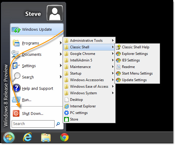
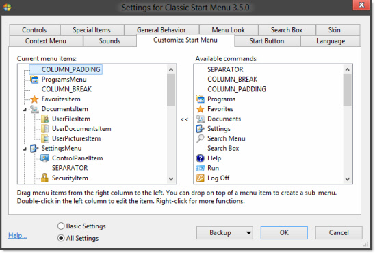
All of it you can change. It has so many options you can spend hours tweaking it to get it just right for your desktop:
Just like Vista I believe the time will come when you are forced into it. Need to purchase a few machines for accounting? Oh sorry only Windows 8 can be pre-installed.
At least with the classic shell you can configure these systems so you don’t have re-train all your users.
One more thing…Subscribe to my newsletter and get 11 free network administrator tools, plus a 30 page user guide so you can get the most out of them. Click Here to get your free tools

{ 17 comments… read them below or add one }
Great tip steve. I too have been playing with the consumer preview. Just installed classic shell and I love it!
So true about the shutdown button. What are they thinking of? Then this thing with charms..ugh! Don’t get me started. The whole thing just stinks.
The metro interface is not that bad. What are you getting too old to try something new?
Hi Markus,
I can easily get used to anything, but lets look at it from a IT managers perspective. Why should I have to re-train all my users? What is the productivity gain? If you were ever in that position you would know that even simple changes can cause all kinds of headaches for users. This is a complete and total change to the way they work every day. You force that on users and they are going to come to your office with pitchforks. They don’t care that MS is trying to beat Apple in the tablet space. They just want to get their work done.
Can you honestly say that they will get their work done more quickly after they have gotten used to this interface? I would say absolutely not. I have been using it for quite some time and I only find it slows me down.
So after you spend all that money training users, your company will still lose more money because those same users are less productive.
Sounds like a great formula for success!
Right on steve. Been using the consumer preview myself and I agree 100% with everything you just said to Markus
I feel your pain steve. I still have a glimer of hope that they will change their minds when they release in the fall. Do they really think enterprise customers are going to upgrade to this train wreck?
Glad to see everyone here love Classic Shell. I test it. It’s exploding in popularity. It was designed because MS started taking away all customization after Windows Vista.
Yep. It is a great program. Well designed, and I like it even more now than the original start menu.
I like the fact it allows me to get the 2000 style start menu. Call me an old fart if you want, but that is what I always liked best.
The worst part for me is that they are removing glass. This is my favorite part of Vista, Windows 7. Why are they removing it? To help fix their battery life problem with tablets. Why remove features for desktop users like me just to make it work better on a tablet?
Hey steve. Any idea if this thing works on 2000?
I sure would like to have the Windows 7 look on my 2000 start menu 🙂
No idea. The best way would be to give it a shot. It is a small download, so your time to test it out would be small. Next time I am on our test 2000 system I will give it a shot.
Hey Muno,
Got into the office today and tested. Classic Shell only supports Vista or higher.
Thanks,
Steve
Btw you can make it look and work like the Windows 7 Start Menu by using the SevenVG skin on AskVG.com. Even the type to search apps and Enter to launch style.
Thanks for the tip xpclient.
Here is the direct link:
http://www.askvg.com/sevenvg-rtm-download-windows-7-rtm-theme-for-windows-xp/
Great way to avoid change management issues at your organisation; deploy an unsupported freeware solution to customise your desktop interface….
Which serious Enterprise Desktop IT Governance team would do that…
Great point FaeLLe
A better question would be “Which serious Enterprise DesktopIT Governance team would allow the switch to Windows 8, causing thousands of hours lost in productivity…just so Microsoft can unify windows for their own selfish needs”