Yesterday Microsoft Released the latest Windows 8 preview.
I have been reading some of the Microsoft blogs, and although this release still has the Aero interface (That glassy look)…according to a blog post by a Microsoft Employee this will be gone in the final release:
http://blogs.msdn.com/b/b8/archive/2012/05/18/creating-the-windows-8-user-experience.aspx
He even went on to say: “…(The Vista and Windows 7 Interface) looks dated and cheesy now”
It was released 3 years ago – not 20. I don’t see it as dated at all.
From an IT perspective this is quite alarming. This attitude tells me they really want to abandon everything and go with Metro 100%. I remember the headaches when they changed Office.
Users would quite often ask for the “old way it worked”..or “Where did all the menus go?”. I know users that still feel they were more productive in the older versions of Office.
If the Metro interface will be the only way to interact with Windows, then you are going to have a load of pissed off users out there.
Lets look at the new version:
It has better driver support, and seems to be faster. Like the previous release, when you log in you are shown a tile view (This is called the Metro Interface) to navigate around:
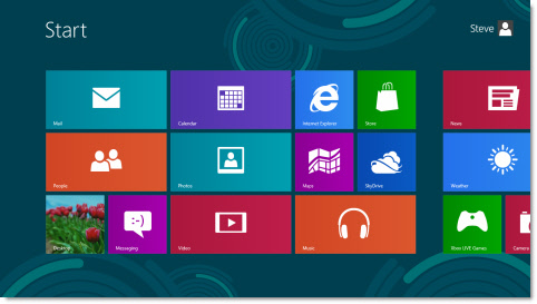
You can get to the old desktop by clicking the “Desktop” tile in the bottom left.
The first thing you will notice, like the latest Windows 8 server preview, there is no start menu:
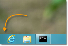
This fact is a source of constant frustration. Almost 20 years of clicking start is thrown out with this release.
Now that the start menu is gone, how can you easily get to the control panel?
There is no tile that says control panel, and when you go to the desktop, there are no links to it.
If things stay this way, imagine trying to walk a user over the phone to try and fix a simple problem…like say changing the DNS entries on their network card.
Thankfully our Remote Control 5 works perfectly with this release…so that might not be a problem if the computer is still on the network 😉
Eventually I made a shortcut on the desktop to the cmd prompt and used that to launch the control panel:
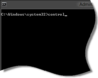
None of the control panel applets have changed, they are identical to Windows 7….so I won’t show them here.
Now back to what it will be like for the average user in your organization.
Most of the tiles you see on the main screen are links to Metro applications. These all run at full screen, and have a smoother look and feel to them.
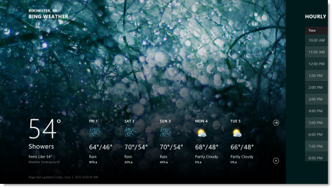
I want you to look at a metro app running on my system. Specifically the weather app:
I have a question for you…do you see an intuitive way to go back to the main screen?
It is none of the arrow buttons.
I tried swiping the mouse from left to right, top to bottom…nothing seemed to work.
To get back you have to click at the very top (not even a few pixels down) and drag down (If you have a touch interface you can swipe with your finger this way too):
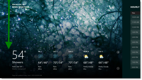
This is sure going to be an exciting change for users. I can just see it now…the power button as a new way to exit Metro apps.
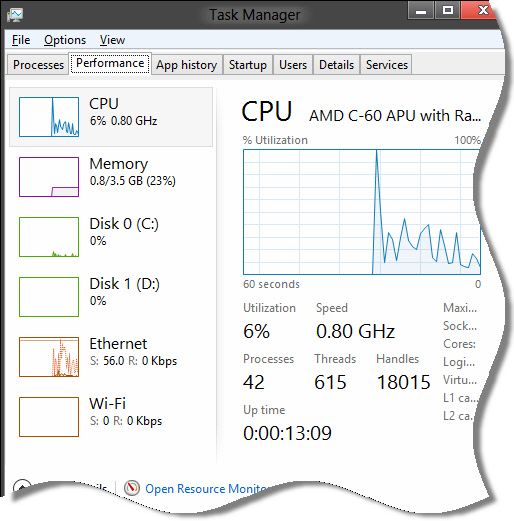
On the positive side, I like what they have done with the task manager. I don’t have the Windows 8 Server preview to compare, but it looks like they have added more functionality to this release.
Look at the concise view they have of all system resource usage:
Many of the user interface design changes are very similar to the Windows 8 Preview I talked about a few weeks back..so I won’t repeat them again. Most of these are great improvements, but they are totally overshadowed by the huge change that the Metro interface brings to the table.
It really is a sad fact that the Metro Interface is a change will haunt you for years…just to make it look different.
I think it is a big mistake. If you don’t agree, ask yourself…when was the last time users in your company or organization were jumping for joy when you made a massive change to the way their computer worked.
For me the answer is never.
Why not go with both? Metro for touch based systems, and classic for mouse and keyboard.
Someone is going to make a mint creating a classic interface for Windows if Microsoft does not include one.
You can download a copy of the Windows 8 Preview Here:
http://windows.microsoft.com/en-US/windows-8/download
One more thing…Subscribe to my newsletter and get 11 free network administrator tools, plus a 30 page user guide so you can get the most out of them. Click Here to get your free tools

{ 13 comments… read them below or add one }
I agree with you 100% Steve. I just installed it myself last night, and I am really starting to worry.
We can treat it like Vista and never upgrade, but eventually it will happen since over time new systems come pre-loaded with the latest.
I can’t wait for the horde of users with torches and pitchforks coming to my office.
It reminds me when it was my fault that all the menus in office had gone away.
Ugh. What a nightmare. The only ray of hope is that they still have not shown us everything. In that blog post you discover that MS is going to reveal all in the final release. So we will get a nice SURPRISE! Hope you like it – Suckers!
We’ll be staying with Win 7 til whatever comes AFTER Win 8.
I am not a fan of Windows 8. My advice to my clients regarding what to do in the future is to stay with Windows 7 as long as possible or migrate to Mac OS X (Lion and then Mountain Lion) because both the existing and soon-to-be-released versions of OS X are more like Windows than Windows 8!
Totally agree with you Richard. That is the door MS is opening. If they make such a radical change…switching to a more familiar OS X (It really is more like windows than Windows 8 ) won’t be as hard. Still…we have all those legacy apps to worry about.
I am hoping they will make this transition better in the final release, but I had the same gut feeling about Vista, and it came true.
Just want to chime in on this post again…I discovered an excellent post about Windows 8 that says the things I felt while using it much better than I did:
http://www.mobileopportunity.blogspot.com.au/2012/05/fear-and-loathing-and-windows-8.html
It is a long article, but worth the read
I have been working with Windows 8 beta for about 4 months now. There are some shortcuts for transferring between the metro screen and desktop. Just hit the windows key on the keyboard to switch between the two. Easiest way to get to things like the control panel is to switch to metro screen and right click on the desktop anywhere. This will bring up the apps bar on bottom of screen. Select apps and a new metro windows will come up with all the programs, accessories etc. But still no start menu. The apps screen has all that would be in the start menu without having to tunnel down to the apps you need.
Thanks for the post Tom. Good info
Hi Folks, I just wanted to update this post with a few quotes from MS:
This will be “the most epic year in Microsoft history,” CEO Steve Ballmer said in his keynote address to the conference Monday morning.
On the acquisition of perceptive pixel (A touch screen manufacturer):
How that meshes with Windows 8 was on display during Monday’s keynote in which Perceptive Pixel founder Jeff Han demonstrated Windows 8 on a conference room-sized Perceptive Pixel display.
He easily pinched and zoomed, swiped between pages, marked up content with a stylus while manipulating the page and content with his other hand.
“It’s so nice to find another company that has aligned visions with our own,” Han said later in an interview. “The transaction means an accelerant in achieving our vision” of large touch screens in the workplace.
So two things. Yes it will be an epic year, and yes it looks like MS really thinks that a touchscreen everywhere is the future. I just can’t imagine being that close to my 30″ monitor. Sorry MS
If Microsoft thinks windows XP is hard to kill off then this release of Windows 8 will be a nightmare for them … not that MS ever gave a damn about what the customer actually wanted.
Reminds me of Windows 3.11, did MS run out of ideas??
Of course, the old way of Alt-F4 will close any of the open “apps” just like it closes a window.
Well this is exactly why since Vista I’ve moved most of my clients to Macs. Microsoft unfortunately just doesn’t get it anymore. Since Bill moved on to other projects Microsoft doesn’t have any vision anymore and it shows by the way they release their products. Unfortunately with the passing of Steve Jobs Apple is most likely going to suffer in the same fashion. But the bright side is it opens up opportunity for the next visionary to move forward, who knows with the way Linux distributions are becoming more and more user friendly we may all be running a Linux distribution in the next 5 years or so as the most predominant OS